Every bus. Every train. Every ferry. Right now, moving, on one map.
Not a schedule. Not a “planned frequency” PDF. Not a rendering in some agency slide deck. The actual vehicles, where they actually are, this actual minute.
I found it at dashingarrivals.com, and I’ve lost an embarrassing number of minutes to it since. It’s a live map of the whole Puget Sound transit system — King County Metro, Sound Transit, Community Transit, Pierce, Kitsap, Everett, and the Washington State Ferries — all of it, all at once. On a weekday afternoon that’s north of 1,100 vehicles breathing across the screen. And yes, I’ve been sleuthing it. That’s the whole point of this blog, isn’t it.
The Whole Region, Live
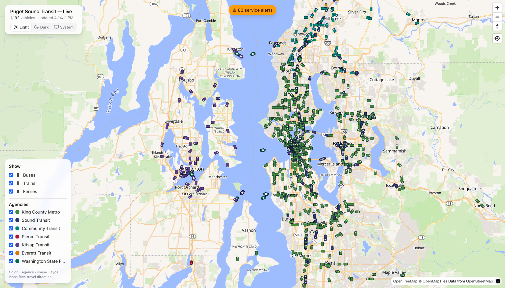
Here’s the thing that got me. Open it up and the region just… resolves. Green dots pour down the I-5 spine. Teal Community Transit coaches fan out across Snohomish County. Purple Kitsap buses cluster around Bremerton, and the ferries — the ferries — leave little wakes across the middle of the Sound like they’ve got somewhere to be. Which they do.
The legend is honest and simple: color is the agency, shape is the mode, and every icon points the way it’s traveling. That’s it. No account, no app store, no dark patterns. You just watch the region move.
Click a Boat, Meet the Tacoma
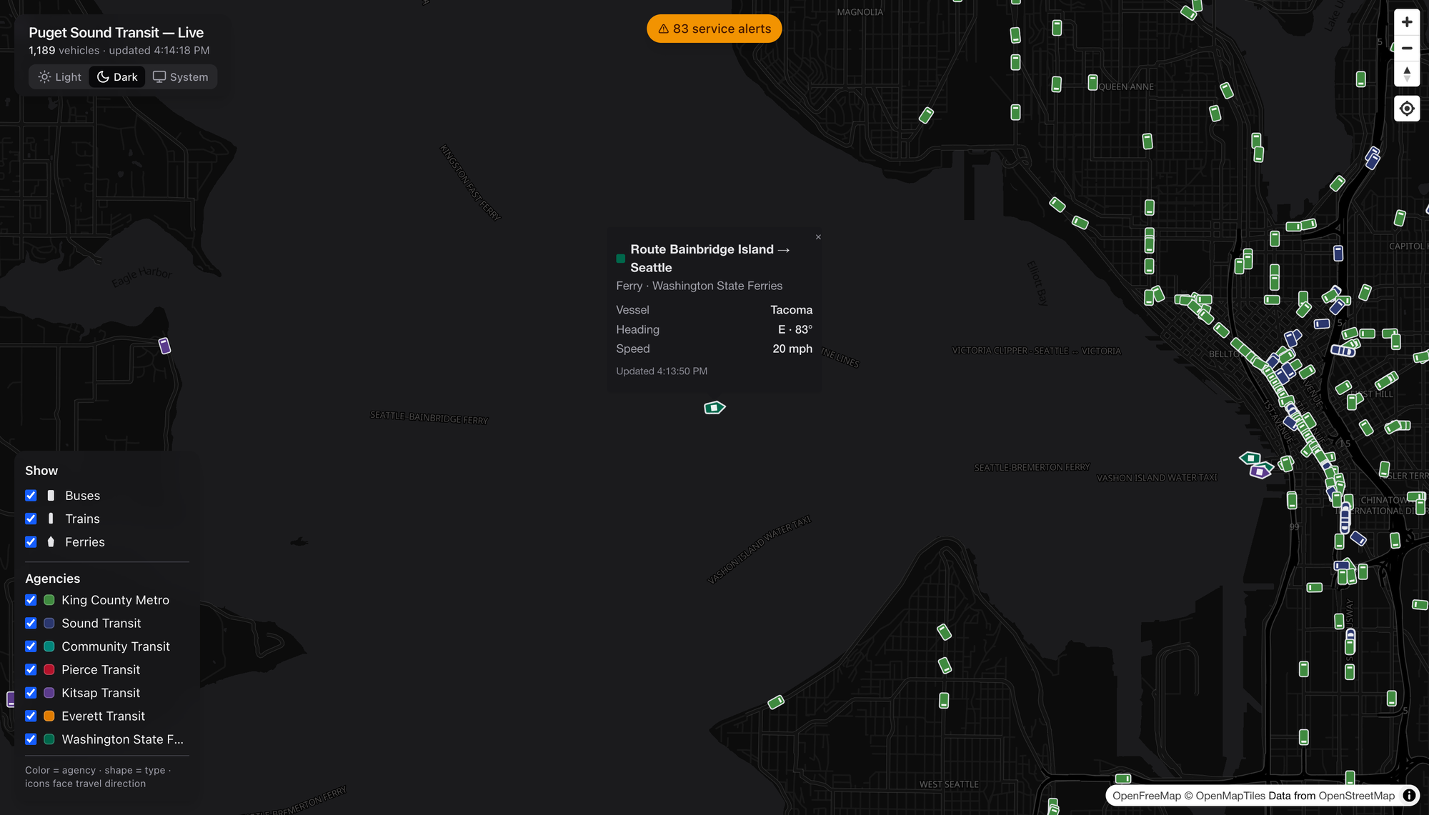
Tap any vehicle and it introduces itself. I clicked a green diamond mid-crossing and got the Tacoma — a Washington State Ferry, Bainbridge Island → Seattle, heading east at 20 knots. A named boat. I did not need that detail to live my life. I loved having it anyway.
Buses give you the coach number, trains give you the car, and everybody gives you heading, speed, and the last time they phoned home. It’s the kind of granularity that turns a map into a rabbit hole.
Show Me the Route
Every popup has a Show route link, and this is where I stopped being casual about it. Click it and the map draws that vehicle’s entire line — the shape and every stop — under the live vehicles still running it.
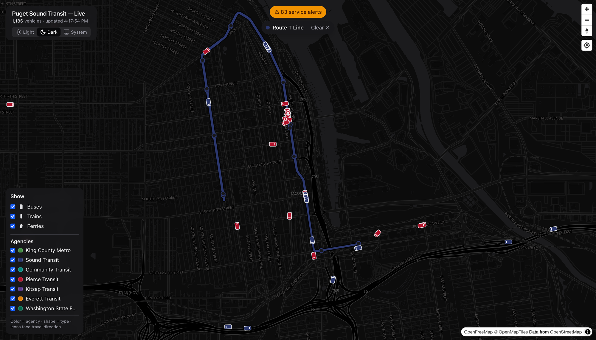
Watch the little T Line streetcar trace its loop through downtown Tacoma, red Pierce Transit coaches swarming around it. It’s a small system. It’s also real, and it’s on the map with everything else.
Rail That Isn’t Just Link
Here’s a public service announcement: the Puget Sound has more rail than most people riding it realize. Sounder is the one folks forget.
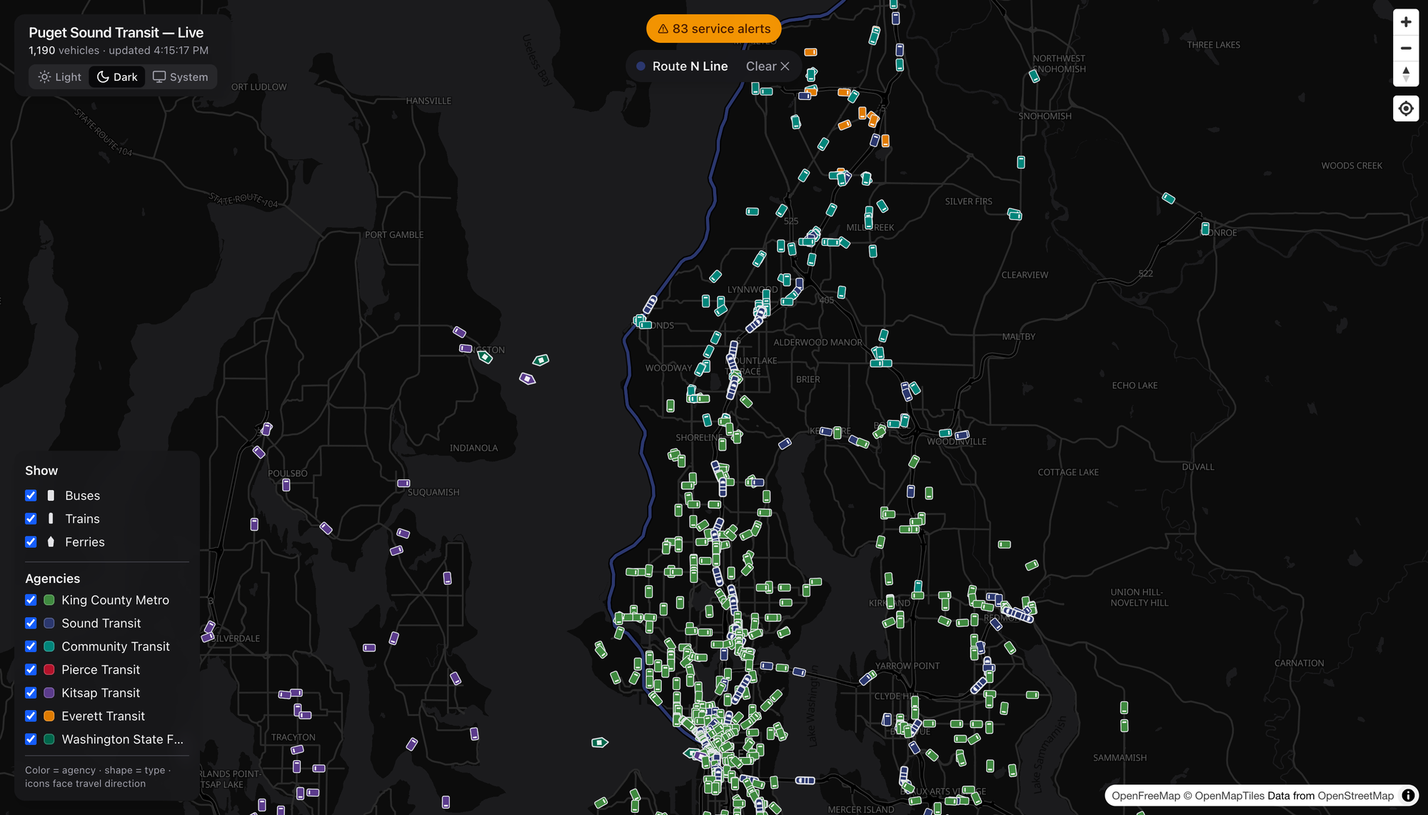
This is the N Line — Sounder commuter rail, Everett down to Seattle, hugging the water past Mukilteo and Edmonds. It only runs at the peaks, so catching a train on the map is a little reward for looking at the right hour. Pull the route up and the whole coastal alignment lights up, with Community Transit teal and Everett Transit orange filling in the last-mile around it. That’s a network — commuter rail doing the trunk, buses doing the capillaries.
Buses Get the Same Treatment
The route trick works for anything with wheels, which means you can finally see what a line actually does.
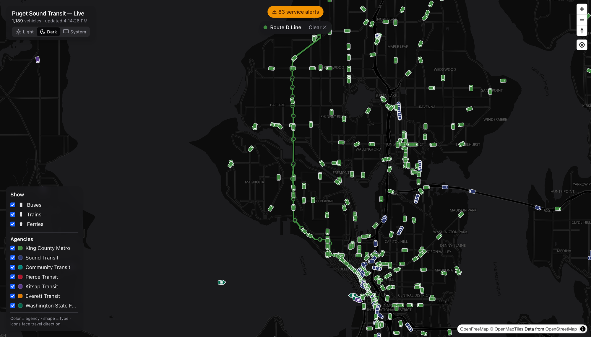
The RapidRide D Line in Metro green — Crown Hill and Ballard down through Interbay into downtown.
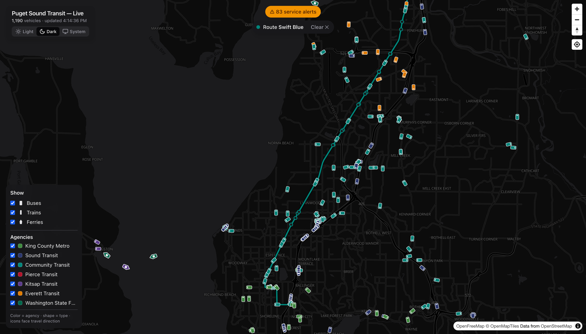
Community Transit’s Swift Blue in teal, running BRT straight down the old Highway 99 corridor from Everett to Shoreline — the kind of frequent, legible, get-on-and-go line I wish we built ten more of.
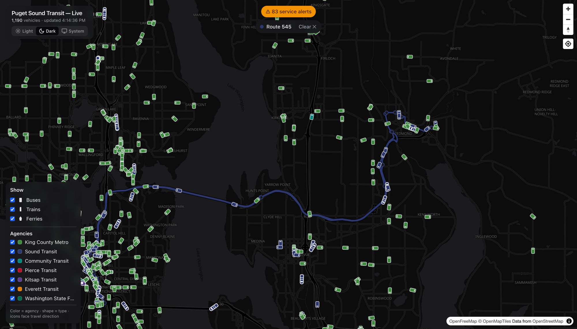
And the ST Express 545 in Sound Transit blue, humming across the 520 bridge to Redmond. Lettered RapidRide, numbered local, Swift, ST Express — pick any of them and the corridor lights up the same clean way.
Filter Down to One Agency
Eleven-hundred vehicles is a glorious mess. So dial it in.
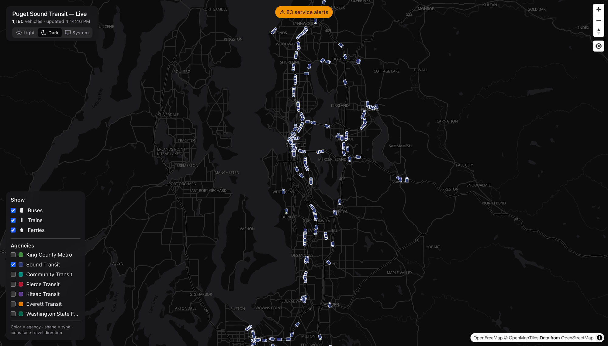
I unchecked every agency but Sound Transit, and there it is — the ST spider laid bare. Link threading north–south and across the lake, Sounder on the corridors, the T Line way down in Tacoma, ST Express filling the gaps to Redmond and Issaquah. One toggle and you’ve got the regional operator’s entire footprint, nobody else’s. Do the same with the modes and you can strip it down to just the boats if you want. (I want.)
When’s the Damn Bus
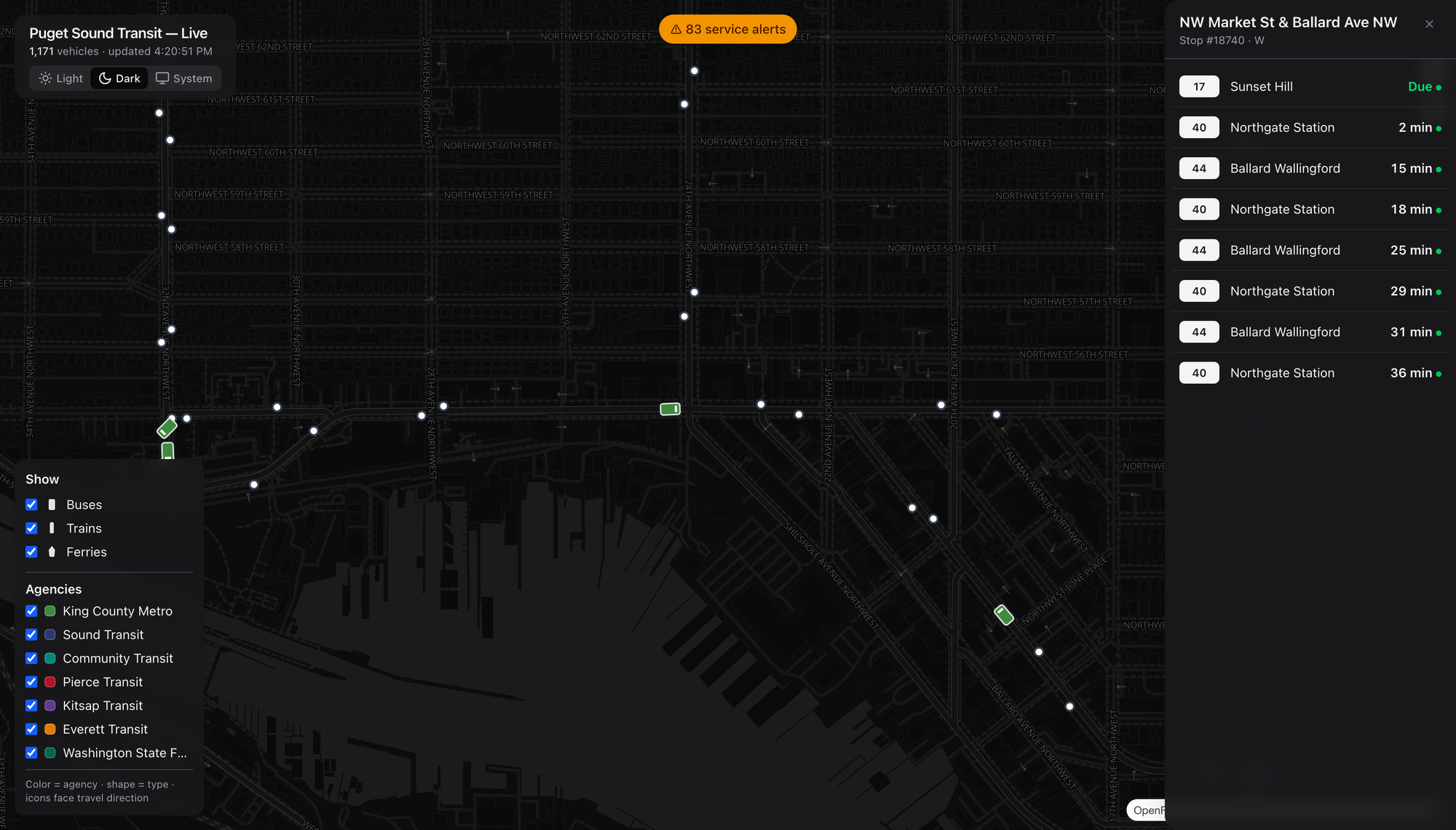
Zoom in and the stops appear. Click one — I grabbed NW Market & Ballard Ave — and you get a live arrivals board: the 17 to Sunset Hill due, a 40 to Northgate in two minutes, the 44 behind it. Real predictions with real countdowns, the same numbers you’d squint at on the sign, except you’re looking three blocks ahead before you leave the house. This is the part that’s actually useful, not just fun.
The Disruption Board
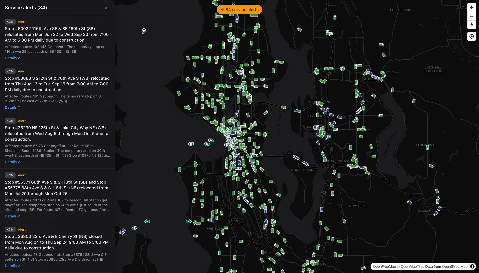
There’s a running count of active service alerts up top — reroutes, stop closures, construction, the usual regional churn — and opening it gives you every one, with the agency, the affected routes, and where to actually catch your bus in the meantime. It’s the “what’s broken right now” board for the whole Sound in a single scroll. Boring? Sure. Boring is exactly what you want from transit information.
Dark or Light, Reader’s Choice
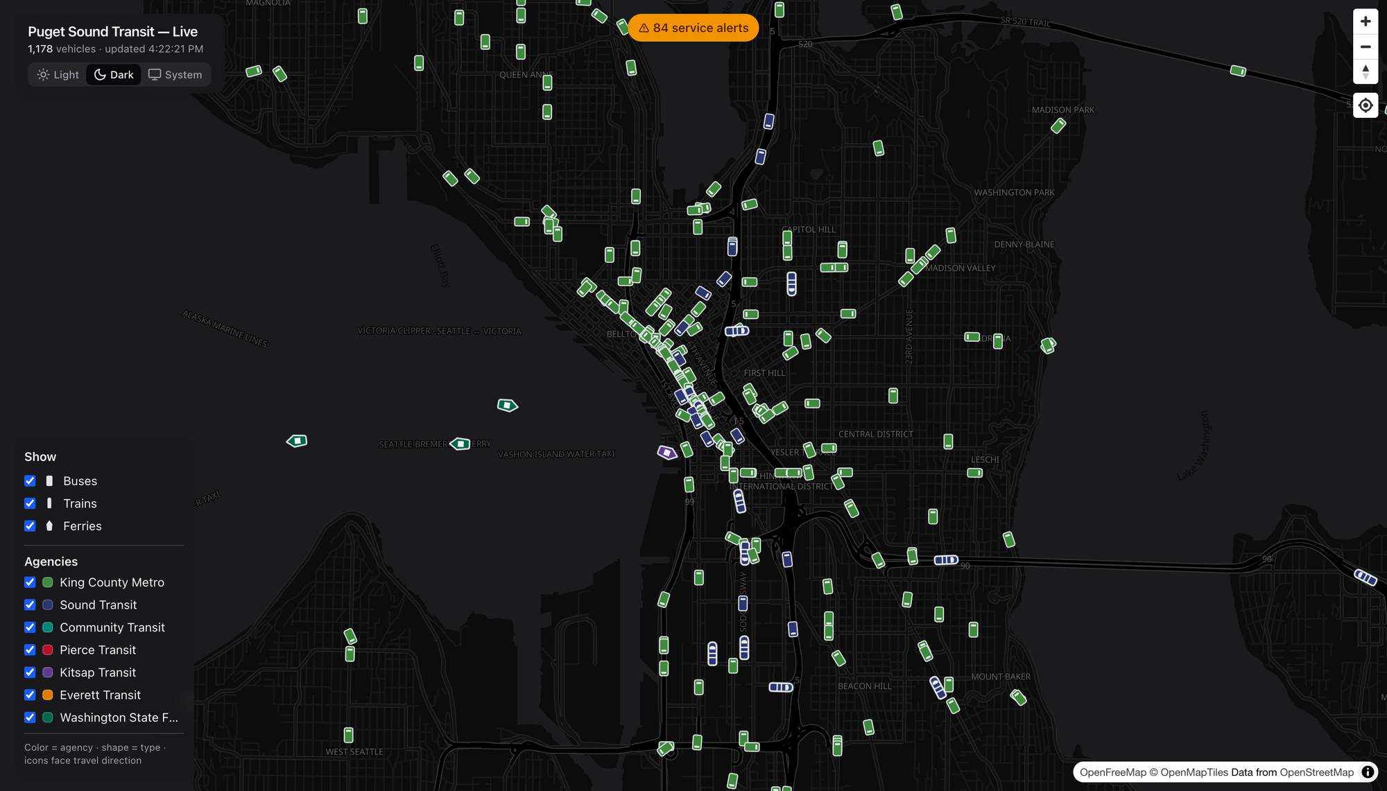
There’s a theme toggle — a crisp dark basemap for the night owls and vehicle-watchers, a bright one for daylight planning, and a System setting if you’d rather it just follow your machine. Same live data, different mood. I keep it dark. Obviously.
What I’d Watch
A few honest notes, because I can’t help myself:
- Coverage is only as good as the feeds. This rides on the region’s OneBusAway data (plus WSDOT for the boats), so if an agency’s real-time feed hiccups, the map hiccups with it. Not the map’s fault — but it’s the ceiling.
- Sounder and the T Line are peak-and-place dependent. Show up off-peak and the commuter rail is simply gone from the screen. That’s the schedule, not a bug, but a first-timer might not know to look at 5pm on a Tuesday.
- This is a watcher’s tool that happens to be a rider’s tool. The arrivals and alerts make it genuinely practical, but the joy is in the whole-region view — and joy is a perfectly good reason for a thing to exist.
The Bottom Line
We spend a lot of energy in this country pretending transit is invisible — burying it under the regional asphalt car-sewer ritual until nobody can picture the network even existing. A map like this does the opposite. It makes the system legible. You can see, at a glance, that the Puget Sound already moves an enormous number of people by rail, bus, and boat every single minute of the day.
Go look. Click a ferry. Show a route. Find a stop near you and watch the next three buses roll toward it. Then go ride one — the best discoveries are always at the other end of a line you hadn’t tried yet.
Enjoy your day dear readers, cheers! 🚈
Screenshots grabbed live from dashingarrivals.com. Basemap © OpenFreeMap / OpenMapTiles, data © OpenStreetMap contributors. Real-time feeds via OneBusAway and WSDOT.

