December 28th, just a few days from the final night of 2014, I’ve set off for a ride around Portland. This year has been a tumultuous year of firsts and a year of frustrations. I deemed it a day I’d wrap up, before the final week of 2014, with one of the activities I unquestionably love combined with enjoying one of the things I love: biking and coffee.
I set off about noon from home. I turned from Park Avenue down on to Salmon and to the Waterfront. There to the Steel Bridge and up the switch back into the Rose Quarter area and on into Lloyd Center.
Before leaving Lloyd Center I cut over onto Multnomah. It seems, the permanent nature of the Multnomah Cycle-track is always a little less then permanent. As I rode along, the bus stop at the intersection on the corner of the movie theater parking lot had multiple cars swerve into and out of the cycle track and bus stop dedicated space. It’s part of the problem when only mere paint is what separates the two spaces. As I rolled on, even the space with the flimsy plastic bollards had been breached. The bollards that had protected the area had been knocked off of the surface of the street and placed to the side of the road near the sidewalk under a tree. Three of them sat there useless, dismembered from the road surface. I rode on. Continue reading →
Let’s talk numbers and the real world. I’m going to lay out a few things in this post.
Why the way we measure auto versus cycling versus transit versus walking commutes in metropolitan areas is an absurd, myopic and broken way to set policy around roads and systems in which modes are used on those roadways.
Why the 6% bicycle commuting number is barely the tip of the iceberg of cycling in Portland.
Why measuring commutes for the entire metropolitan area is counter productive for the city of Portland the surrounding cities of Hillsboro, Gresham, Beaverton, Tigard, Milwaukie, and other places in the metro area.
#1 – Measuring The Commute for the Metropolitan Area
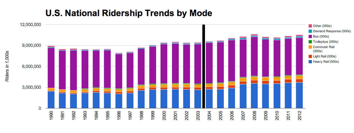
The way urban planners, traffic engineers, and others measure the daily commute is usually by modal splits. What that means is each mode is assigned the percentage of the trips taken with that particular mode.
Let me detail the current way this is measured with an example. There are 2,314,554 persons in the metropolitan area of Portland. At the current labor force participation rates in the Portland metropolitan area we can safely assume that about 50% of these persons would be commuting to work. That gives us about 1,157,277 persons traveling to a place of employment and back every day.
Based on the 1,157,277 daily commutes in the metropolitan are of Portland, at 6.1% the area has about 69,436 people cycling to work everyday. Just think about that for a minute, that’s a sizable number of people bicycling. But is this an honest measurement of Portland commuting as a city? Does the metropolitan area really represent the city? Does that 69k+ people represent cyclists in Portland?
A quick side note…
For the actual city or Portland the population is 609,456 with the commuters coming to about 304,728. Here’s a map of the actual city of Portland, note the red outline around the city.
The City Limits of Portland
I won’t write about these numbers just yet, but I’ll bring them back up further along in this blog entry.
Is Gresham Portland? Is Hillsboro Portland? Is Salem Portland?
Let’s dive in on what exactly the metropolitan area actually is, then we can look at how ridiculous this measurement really is. Here’s a map of the metropolitan area of Portland.
The Metropolitan are of Portland
Do you see how big that red area is? That is the metropolitan area of Portland. Does this strike you as a bit odd? Based on what is included in that area, the 6% measurement is absolutely amazing. It’s super impressive when the area is, by a huge order, completely suburban and rural areas that happen to all fit inside of this giant metropolitan area. Wikipedia even has a completely stand alone page dedicated to Portland’s metropolitan area (as it does many other metropolitan areas). This is the normal area that many statistics are derived for policy and decision making at federal, state, county (parish), city and even at the neighborhood level sometimes.
The metropolitan area of Portland includes;
Vancouver, Washington @ 161,791 people
Gresham, Oregon @ 105,594 people
Hillsboro, Oregon @ 91,611 people
Beaverton, Oregon @ 89,803 people
…and many others.
The 6% number is completely irrelevant, as are any modal splits, based on the metropolitan statistics for each of these cities. Including the city of Portland itself at 609,451 people. So why do we measure at the metropolitan level and then attempt to make quotes and other speculations or even decisions for our city this way? It’s a very valid question considering how often many of the cities surrounding Portland and Portland itself make decisions based on these metropolitan measurements.
There is some use of these statistics that are valid, but time and again they’re brought up to say “the majority of people drive” and “nobody rides bikes” and “barely anybody walks” when that might be true for some auto-dependent neighborhood in Vancouver, Washington but it is absolutely not true for the actual city of Portland. So why hold Portland to the condemnation of the metropolitan area’s statistics? It comes up all the time, people making pro- or anti-biking arguments based on the 6% number. Sometimes people even compare the 6% metropolitan number to the plan to get 25% mode share in Portland (the city) by 2030. Who’s kidding who, we aren’t getting anything positive out of the suburbs in this regard, they’re going to still be polluting the inner city with their commutes and killing each other with their cars by the time Portland gets to 25% mode split.
One last reason to toss this whole metropolitan area focus, especially for the 6% cycling mode split, or the 81% automobile mode split, or whatever number you’re comparing. Let’s get down to the business of the actual communities. Portland is not Gresham, Gresham is not Vancouver, and the others’ are not this or that part of the city. They each have different metrics. But the city of Portland itself has a bicycling mode split for transit that is huge and one for cycling that is also much higher than the metropolitan area. The city of Portland also has a minority use of single occupancy vehicle trips. This might be painful, but give this report and good review. Yup, that’s 43.9% auto use for trips in the CBD. CBD stands for central business district. That’s down from 58.4% in 1994, a pretty damn good improvement. In the CBD transit usage is at 44.5% of trips, up from 33.6% in 1994. These are the types of numbers we actually need to look at to determine goals, not the misleading data of the metropolitan numbers.
#2 – Tip of the Iceberg of Bicycle Usage
I’ve talked about the absurdity of following metropolitan numbers in determining policy in Portland, now I’m going to take a stab at this 6% nonsense. The 6% number is great for the metropolitan area, like I was saying, that’s an impressive achievement when you factor in all of the blatantly hostile areas where some of the riders come from. As anyone who rides regularly knows, a bike lane right beside 30mph+ traffic is tantamount to insanity. There is zero comfort when you know one cell phone talking motorists swerves a little and your life is over. The vast majority of our roads and ways to get into and out of the city of Portland area are still these types of roads. There are very few dedicated paths or cycle-tracks that would encourage the mythic 60% “interested” population to jump on a bike and ride into town. Albeit among all of this frustration with the current 6% number being stagnant for several years now, there are a few trends that lead me to believe that this 6% isn’t all it’s cracked up to be. Here’s my list of why the 6% number is illegitimate at this point:
The first reason, goes back to the first thing I wrote about in this blog article – metropolitan numbers aren’t representative of the area we’re trying to measure, which notable is the city of Portland, not the metropolitan area. So let’s measure Portland, not Gresham and Hillsboro and the other areas. PBOT and the city have almost zero net impact on how those cities determine and act to improve cycling, so we really should focus more specifically on Portland’s numbers instead of the averaged number across the entire metropolitan area.
Who’s ridden across any of the bridges that have cycling measurements lately? Notice how on Hawthorne this year (2014) the same drop off didn’t occur in cycling commuters during the winter time as in previous years (2013, 2012, 2011, etc)? It looks like, and I’m waiting to get hold of the actual data, that the drop off was only about 10-30% off of the peak summertime commuters instead of the traditional 40-60% drop off! That’s huge. If that is being maintained, it would appear that somehow there are more consistent riders – which wouldn’t show an actual increase, but it would also lead to a ground swell of advocates that are really holding to it. But that leads me to the next observation…
Who rides around on the east side on weekends or during the week? Ever noticed how there are steadily more and more cyclists going about their business on the east side during the day? I did a couple of measurements: 34th and Clinton, 35th and Hawthorne, 35th and Belmont and Going at the 15th Street Diverters. At each of those locations I saw a steady increase in ridership over the year that I was riding across these areas during the day to do business. I’d stop and count for 15 minutes at a set time each day. After the year and numerous measurements I saw an increase of about 15-20% at each intersection. Even though the results weren’t done in a rigorous way, I did follow a scientific approach. Even without the rigor, and doing this out of pure curiosity, I can’t really ignore them since they were consistent over time.
The simple observation is this. Something is happening within the biking movement in Portland, and it isn’t a decreasing bike share of commuters. There is instead a ground swell of advocacy, an increasing frustration with the speed infrastructure is being built and the kind, and there is a growing love of biking among many in the city. They may not be bike commuters yet, but there is a huge percentage of people out there biking in other ways, and the simple fact is we aren’t measuring them, even though they should indeed count!
#3 – Why measuring commutes is … not a good measurement!
I’ll dive straight into these reasons.
Commuting makes up a trip to work and a trip from work. That’s it, two trips. The average household makes 9 trips per day (see references below, there’s tons of data on this). Why is the measurement we use that dictates the vast majority of transportation policy dictated off of trips that only make up 2 our of 9 trips a day for a household? Fortunately in many cities, the cities take it upon themselves to determine what these other trips are and focus on these trips instead of commutes. However much of US policy at a federal, state, and even many cities, is entirely focused on commutes first.
Commutes leave out everybody that’s not in the workforce, which in the Portland metro is hundreds of thousands of people, and even in the city limits of Portland itself is over a hundred thousand people. That means transportation policy dictated by “commuting data” leaves out an absolutely massive percentage of people. Are you a stay at home mom? Generally not included. How about a student in school? Yup, you’re not really included either. How about a retired person or someone looking for a job? Nope, you’re out too. That’s just absurd.
The ideal commute is not having a commute. We as a society often encourage remote worker situations, which completely removes someone from commuting. However a remote worker still makes the average number of trips based on household data. This means we’re pushing for people to work from home, remove themselves from the commute, but ideally we’d shift away from the daily commute dogma altogether! So why do we use it as the core policy planning and decision making metric? If anything we should take hold of the data from the OTHER trips and work with that data, the 7 instead of the 2. One might say it’s because everybody commutes and it is the easiest and most problematic event of the day – being it causes rush hour. But really, think about that for a minute and why do we still encourage rush hour with such zeal and gusto? If there’s a problem with the game, maybe we need to change the game!
Summary
Data is a fickle thing. There’s a reason the saying, “lies, damned lies, and statistics” exist. Numbers and data can be used to derive solid, intelligent, and wisely built solutions to problems. But they can also be used to do the exact opposite. When we discuss things we need to form real stories and cast out the absurd misinformation that is spread around by using single metrics. Stories need told with multiple measures identifying the full point of view of individuals in society. A single metric never produces an intelligent and well structured system of solutions, it just leaves us behind.
I’d like to see us move forward more in the United States. Understanding the systemic nature of measurements (the Research Center OHAS 2011 summary is a good starting point) and how they interact and work together will help us actually do that. Cheers, and happy number hunting!
References
City of Portland population of 609k was pulled from the Wikipedia page for Portland, Oregon. It can also be found via the US Census Data, which puts it at the 29th most populous city in the nation over 50k persons.
Mode splits as measured by Metro in the Portland metropolitan area are available in this Research Center OHAS 2011 summary (originally linked here, but I’ve made the link available via my blog in case it disappears from their site).
The final proposal for bus changes when the PMLR (Portland Milwaukie Light Rail) line starts running and the respective changes are in place have been posted. I’m stoked about a few of the changes that I’d already assumed would take place.
My favorites of the list include:
The #9 and #17 are both going to start running over the Tilikum Crossing Bridge. This is going to make the rush hour service for these buses dramatically better. I used to live at 20th and Powell, and during normal times of the day it was about a 10 minute bus ride on the #9 or #17 to downtown, but during rush hour it could be anywhere from 20 minutes to 60 minutes, depending on the Ross Island Bridge. With this change, that cluster of car catastrophe will finally be over for those bus routes!
Even though it is rare that I’m in the area on these routes, the #31 and #33 will actually become more relevant and usable for me to do business south of Milwaukie. Today I sometimes will go down to Milwaukie to meet with or work with clients, but I’d never go west of or south of Milwaukie from Milwaukie itself. Usually I would just refuse customers or other work from those areas (not that there is much to start with), and those prospective customers would unfortunately lose out. Now myself and others have an increased service area based on these new routes.
Clinton Street Chaos
Some odd things have happened as of late in the drama of Clinton Street. One of the most awesome things of the last few days was the release of a diverter, done in a beautiful Portland style using tactical urbanist maneuvers to get drums put into the street to divert cars off of the bike boulevard! Personally I find it bullshit that the city went out to remove them so quickly, since they can’t replace potholes or do other things that they are actually supposed to do within a reasonable time frame. They should have left them there for at least the early morning, and let the early morning children bike trains enjoy the added comfort of getting to school that way, or simply the safer conditions that other cyclists (thousands mind you) would have on the route.
The other thing that has changed in the area, is a few strong riders that I talk to regularly have all started – or plan to start – just riding in traffic on Division. The reason being is Division traffic moves at a more reasonable average speed (lower top speed, faster from point to point) than over on Clinton now. The idiots using Clinton as a short cut spurt down the road at 30 mph sometimes, endangering anybody on or around the road and oncoming traffic as they recklessly pass. So since this isn’t even possible on Division anymore, it makes it a somewhat faster and safer street for anybody traveling on it. Albeit the “street skippers” barreling down Clinton are to damned stupid to realize this, because they’re in “must hurry and win the rat race” mode that they don’t stop to realize that a higher top speed doesn’t get them there faster.
Either way… the whole of Clinton, Division and especially the growing auto-train-pacolypse that is going on at the nexus of 11th/12th and Clinton and Division is a growing catastrophe. I’m hoping to write more about this in the future, with some thoughts are real solutions now versus the solutions that we’ll need but will take 10+ years to get them into place!
Division / Powell BRT
So there’s this myth (and yes I know they’re actually workign toward getting it actually built, whatever it is, has been discussed here, here, and here among other places, but I won’t believe it until they break ground with a real plan) that Portland will be getting BRT along Powell and Division. The idea is that BRT would probably run over the Tilikum Bridge (since it already is technically real BRT) and then go onto Powell until 82nd or other section, cutting over to Division on to Gresham. I’ve got a lot of thoughts and ideas about how to really connect the Division corridor to BRT, and cutting across on 82nd I’m not sure is the best spot. BUT, this is huge for many obvious reasons. The most obvious one is that both Division and Powell are in desperate need of better transit service. I however have a massive fear about this project…
The Fear
Will it be real BRT, and if so, where in the hell will it go on Powell? Further out past 39th (and even a little before) heading east there is plenty of room to move sidewalks and roadways around to make space for BRT. The only way, and this is only if Portland is serious about helping people become the focus of this city instead of automobiles, is if the city is willing to get brave and take away some actual auto-capacity. This would be a real removal of auto-capacity on a major street, not some pretend removal like the theoretical removal of auto-capacity on streets like Burnside or Foster, because the capacity at current is barely affected by road diets because the capacity throughput requirements are manageable in every other hours of the day except rush hour. On Powell, getting BRT wedged in there will for sure cut back on actual SOV auto capacity. Either way, one day, Portland WILL BE FORCED to make changes to this area that will result in auto-capacity decreases, so the sooner the better.
Does anybody have any other details on this yet? Will it be real BRT? Are there already plans to cave before the selfish-misguided pressure of auto-lobbyists to maintain current auto-capacity over the needs of all citizens? How is that going? What’s up in the region? I mean, I kind of live here, but it’s still hard to keep up with all the exciting, wild, sometimes crazy things going on! 😮
I’m sitting here digging through videos on YouTube and here’s this video Al took a while back. I’m not entirely sure who did the edits, but I have a few minor contention points. Here’s the video first:
Is the MAX dangerous based on un-correlated and non-causal crime?
Minute:Second 2:28 – 2:50 – I’m seriously not even going to respond to this insertion of media alarmism and FUD in the middle of this clip. That is a seriously disingenuous association, it is dishonest to even associate that with failure or success in any way. Pulling in outlier data, and pushing and implication that the MAX is a crime train or something of that nature is just extremely cheap and petty. So it’s not even getting an answer from me… just bring data next time and stop being disingenuous. I can argue this but it’s just ridiculous that this is even inserted in there, it’s at best a distraction to simpletons that will then immediately say something ignorant like, “see, it’s a failure there’s some stabbing…”
Is MAX Ridership Not 100k (or more) ?
Minute:Second 2:57 – There’s a flash of some stats from an unspecified time that are supposedly Trimet’s ridership numbers. I’d stated that Trimet ridership on the MAX was 100k or more per day, which was a conservative estimate on my behalf. The data that was shown however was not accurate. Check out the actual PDF of performance information from Trimet itself. Now scroll down to the ridership data for April of 2014 which is the post time of this video (and relatively close +1 a month or so when Al and I actually met and had this conversation). The data for April 2014 is shown below:
Note the MAX Ridership for April 14 is at 121,400. A mere 1.1% decrease over the same month in 2013.
As you can see, I was being extremely generous in saying the MAX carries merely 100k passenger trips a day, when in reality it registered over 121k that month.
Answer: Yes, I was correct in stating that the ridership is at least that much. It’s the opposite of hyperbole, it’s a conservative estimate, which makes the implication I was making absolutely true.
Is bus ridership barely 3 times what MAX ridership is even with 50 or so bus lines as I said in the video?
The ridership for Trimet bus lines, all of them (not including the paratransit, which is only 21k trips) comes in for the month of April at 335,030 passenger trips. That’s some pretty good ridership.
Bus Ridership at Trimet
but if we do some math, if Trimet MAX’s ridership is 121k, and we multiply that by x3, we get 363k, clearly more than the 335k trips that were registered.
Answer: Yes, again, my statement was a simple conservative statement that again proves the point that the MAX, by line count, carries dramatically more people than the entire bus system put together. I made no other correlations than that, so no I’m not saying one could exist without the other, or any such thing. I merely stated one point.
So are there only 50 bus lines in Trimet’s System?
Well I did a little manual count (maybe I’m off by +-1?) but I got 80 bus lines on Trimet’s page here. Feel free to count. But agian, a conservative guess at the number of bus lines (and yeah, I should know the number of bus lines by now, but I only knew a very rough low balled amount). This makes the point even more direct to the point I’m making, in that the bus system has 80 bus lines and ONLY carries 3x as much as the MAX.
Answer: Yes, there are at LEAST 50 bus lines, after counting them there are 80.
So is MAX a failure by this measure? Is it truly ridiculous?
The MAX, based on this number of lines, carrying 25% of the passenger trips but only making up 1/20th of the actual lines is by no measure a failure. Looking at that same data for April we can even find more evidence that the MAX lines are doing fine, with a cost per passenger trip at $2.02 while the bus is at $3.27.
Answer: MAX is in no discernable way a failure based on metrics of subsidies and rates of usage for buses. One could make strong arguments that it even does even better against other Trimet modes too (re: Streetcar, WES).
Is MAX Blue Line the only successful line?
Minute:Second 3:26 – Is the Blue Line the only successful line? Study the data more. None of the MAX lines are operationally expensive compared to any bus lines. Even the most efficient bus lines (like the 72, 9, 4, 14, etc) do only slightly better than the Yellow Line and sometimes better than the Green or Red Lines. Most of the time they’re all extremely efficient in cost per passenger trip.
Answer: No, they’re all successful by the metrics available, even the dramatically lower ridership Yellow Line.
Is the Skytrain the only unquestionably successful transit in North America?
Answer: Yes, go look it up, I’m not digging that up for you. But it turns an actually net operational profit, which means that it makes more money from fares during operations than it takes to actually run the trains. That money, is then in turn used to subsidize the less efficient bus service throughout the city that costs more to run per passenger trip.
…then during 4:20- some time Al wants to now say that none of this matter that transit is a human right or something, but when we compare things we have to have a metric. Nobody said anything about what transit modern purpose is, we’re comparing what is success or failure, and actual metrics.
Green Line stole ridership, is it between 22-28k per day?
Minute:Second 4:44– Current Green Line ridership passenger trips is 24,300 at last count.
Answer 1: Yup, the ridership is at the levels I stated.
Answer 2: It did not steal ridership from the bus routes. Every route that the Green Line crosses that travels east and west (this include sthe #4, 9, 14, 15, and a number of other buses) all have seen ridership increases during the time since the Green Line opened. The #72, which runs parallel and crosses under the Green Line has also seen its ridership maintained or increased over that same period, month-to-month and by any other metric. The data is available, to get some of the specifics you will have to get a FOIA for Trimet to dig it up, but the data is there, just from the totals that are provided on the site (just look at the link above and check out the ridership for bus/MAX) and you’ll see that overall the ridership has generally seen an upward trend since the Green Line opened in 2009 versus a downward trend.
…this blog entry is dedicated to Al. Cheers man! It’s always fun.